Overview
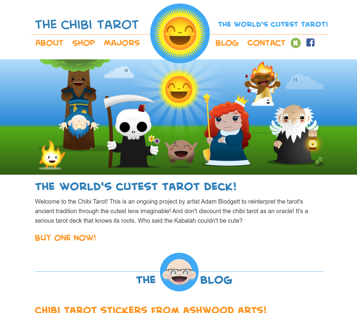
Redesigning the Chibi Tarot site was a labor of love for me. The major’s only deck was a kickstarter project I launched five years ago and have worked to maintain and improve since then. The website had been out of date for a long time, and was eventually hacked forcing me to use a standard theme that looked really crappy. It was clear that I needed to improve the site’s look, but there were a number of other considerations beyond the site’s styling that needed to be dealt with.
Challenge
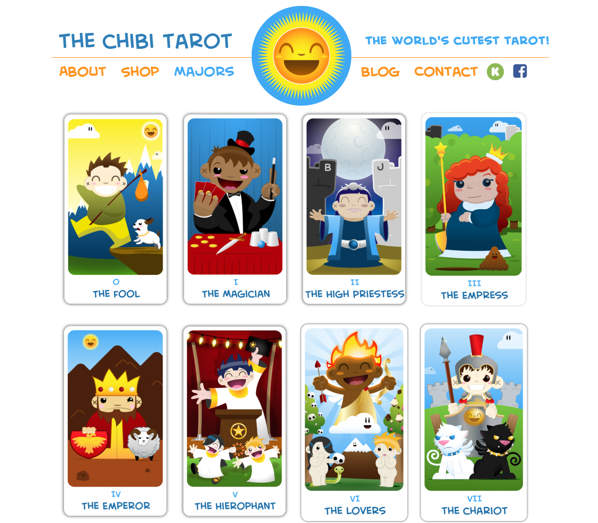
1. Quickly getting the user access to all 22 cards in the major arcana without taking up too much space. Part of the beauty of the deck is that each character has their own story to tell. An incredible amount of time and effort went into these cards and making sure that each one is given its due is a difficult thing to manage. While each card gets their own page along with a description of varying length getting the user to that information was proving difficult as the homepage was a bottleneck.
2. Improve the visibility and trustworthiness of the store
The bottleneck was also choking off traffic to the store. Increasing traffic to the store, improving product representation and the trustworthiness of the store were vital to the success of the site.
Solutions
Home Page
While most image sliders aren’t effective, showcasing 22 cards without taking up an entire page demanded some kind of compromise. I chose a slider not out of habit, but out of need. The image slider below the introduction quickly and easily showcases all 22 cards in an attractive and interactive format that works well across the device ecosystem. It quickly introduces the user to the product without overhwleming them with every card or a lot of unnecessary text.
Cards
The biggest technical solution was to create a custom post type for each one of the cards in the major arcana. There were two advantages to this. One, it separated out the card content from the rest of the blog content on the back end, giving it higher visiblity and a sense of indepdendance, and making it easier to manage the varying types of content. Second, it gave the cards their own SEO friendly URL, aligning more closely with the optimal format recommended by MOZ(https://moz.com/learn/seo/url).
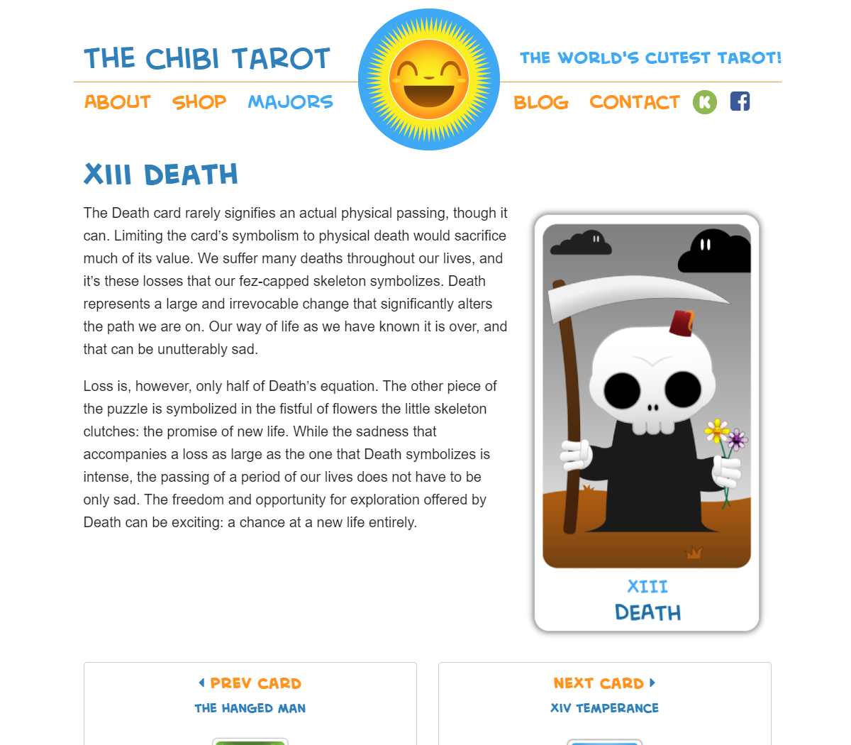
Singles
Each card now has a custom in page navigation that allows the user to more easily browse the cards without having to return to the main menu. Both the “Next Card” and “Previous Card” navigation elements include the image for the card, making it more visually compelling and immediately recongizable. The easy and attractive navigation helps keep users on the site and has helped reduce bounce rate.
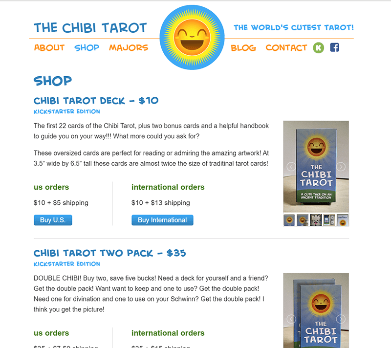
Store
Improving the store was relatively straightforward. First I clarified the two differeing ordering options to US and International, then used a very standard looking button. I chose blue as a more trustworthy and recognizable button color instead of orange, which conflicted with the theme pattern, but I thought it was important enough to do that here.
I also created a number of product photos that I shot myself over the course of a weekend to give the user a sense of the size of the cards as well as their physicality, which is an important aspect of owning an artifact.
Results
The result is a vibrant, colorful site that improves access to the content, gives the user tools to navigate quickly to the information they’d like, whether that’s the shop, the blog or one of the 22 cards. Since the new design sales are up, site visits have increased and the length of visit has increased.